
I finally completed “Firs in the Fog”, my culminating project for a design class I took in 2012-13. The class covered design principles like scale, proportion, value, and balance. It really was an art class for quilters and for the final project we were to pull all the lessons together in a single work. 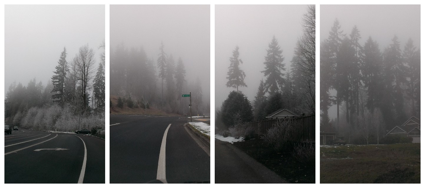 For a long time I’ve been fascinated with fog and how it hangs in the valleys and washes away color in the landscape. Fir trees become abstracted and their color value diminishes with distance. Just about the time of the final assignment, we had a really foggy period and I got some photos for inspiration.
  Dark fabric forming the tree contrasts with the lighter indistinct tree forms and brings the tree forward. Larger patches ground the image and large amounts of foggy negative space balances the strongly contrasting foreground tree. The Rule of Thirds drove the tree placement and my inspiration photo stayed on my design wall for reference while placing the patches.
  The aspects of this design which made me work hardest were color and value. You would think fog would make everything flat gray, almost achromatic, but fog has the subtle color of the greens and browns in the landscape. Those light and light medium warm and cool grays are hard to find in fabric. I cut many squares of fabric trying to replicate nature’s gradation.
  While I had my quilt top finished for the final class, the quilting choice simmered for a long time. I wanted a texture which would further soften the design and would mimic the billowy nature of fog. A serpentine stitch in gray thread turned out to be the winning option. A facing (a first for me) finishes the edge of the quilt without adding another design element.
Quilt Stats:
- Title: Firs in the Fog
- Original design
- Started March 2013, Completed January 2015
- Size: 19 3/8 inches wide x 27 3/4 inches long
- Quilting stitch: Bernina 440 Stitch 04, stich length 3.0, width 5.5
- Quilting thread: Aurifil 2600, 50/2 weight
Takeaways from this quilt: The two mantras from the design class – “Make visual decisions visually” and “Color gets all the credit, value does all the work”
Favorite things about this quilt: the subtle, almost achromatic color, the value gradation, the facing which was not nearly hard as I thought thanks to Victoria Gertenbach’s tutorial on The Silly BooDilly.
Things to try next time: the faced finish, pixelated design (got to use up the gazillion squares I cut), similar design in a larger scale


oh I really love this Martha! Appreciated hearing all about your inspiration and process.
Thank you, Debbie. I’ve never brought this quilt to Guild because I’m not sure if it’s “Modern” or “Art”. What do you think?
This is a fantastic finish. I especially like the quote, “Color gets all the credit, value does all the work” as that resonates with me. In my mountain pass town we get a lot of fog in the winter (sometimes I say we live in a cloud in the winter), and you got the looming shapes in fog captured so well here.
You’re so sweet, Yvonne. Working in an almost achromatic color scheme does bring value to the forefront. I usually have to resort to a b&w photo to see value. How do you determine value?
I like to use B&W photographs, or looking at the fabrics (if I have them on hand in person) in low light level conditions. Squinting can help sometimes, too! 🙂
Really like your design and the finished quilt, Martha. It’s a very skillful use of what looks to be a challenging colour palette. Good to meet you across the 2015 Blog Hop.
Thanks, Allison. You wouldn’t believe how many greens and browns I cut and tried to force into the quilt. Referencing the photo helped keep me on track.
…love this and can feel the heavy misty air.
Oh, yay! That’s the feeling I was going for. Thanks for saying you can feel it.
Thanks for sharing your quilt. It was interesting to learn about your inspiration and process.
Thanks, Marla. Your comments mean a lot to me since I’m a huge fan girl of your work!
Love this!
Thanks, Rachel!